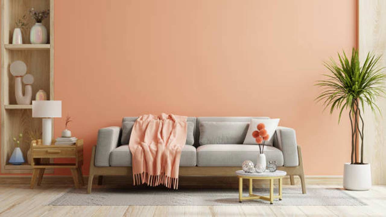
Summary:
A monochromatic colour scheme uses different shades, tints and tones of one base colour to create a home that feels cohesive without becoming visually repetitive. The approach can work in different rooms, including the living room, bedroom, dining area or other places, when balance is achieved between colour depth, texture, lighting and materials. Starting with selecting an appropriate base colour and contrasting it by using furniture and wall finishes, a monochromatic palette can provide consistency while still giving every room its own character.
Introduction
Using one colour family throughout a room does not mean painting every surface in exactly the same shade. A successful monochromatic scheme works through variation. Lighter and darker versions of the same colour can define different surfaces, while furniture, fabrics, flooring and décor introduce texture and depth.
This can be very helpful when people desire to have a space that is calm and coordinated. But if there is not enough variation in the use of colour, then the space looks monotonous. If the variation is of high intensity, then the colour may look too intense. The key is to create a clear hierarchy between the dominant shade, supporting tones and smaller accents. For homeowners exploring home interior designers in Bangalore, colour planning can be especially useful when different rooms need to feel connected without looking identical.
How Does a Monochromatic Colour Scheme Actually Work?
A monochromatic colour scheme is based on a single base colour, which is extended by using lighter, darker and more muted versions. For example, a palette of blue could move from a pale blue wall colour to mid-tone upholstery to navy blue accents. A beige scheme may incorporate elements of cream, sand, taupe and darker brown without bringing in an unrelated colour family.


The simplest method for building the palette would be assigning a unique visual function to each colour. The lightest version can cover large areas, a middle tone can show through furniture or curtains, and a deeper shade can define smaller elements such as cushions, artwork, etc. This gives contrast without ruining the colour combination of the entire space.
How Can You Choose the Right Base Colour for Your Home?
The base colour should reflect the amount of natural light, room size and atmosphere you want to create. Lighter neutrals can make compact rooms feel more open, while deeper greens, blues or browns can create a more enclosed and intimate mood. A cool summer color palette can also provide inspiration when selecting softer blues, muted greens, pale greys and other cool-toned shades for a calm interior.
Existing finishes should also influence the decision. Flooring, wardrobes, kitchen cabinetry and large furniture pieces are difficult to change frequently. This means that the colour palette needs to work around them. It is useful to test paint or material samples at different times of day since natural and artificial light can change how the same colour is perceived.
A 2018 study published in Frontiers in Psychology examined 443 students living in six residence-hall buildings that differed primarily in their interior colour. Participants had lived in those environments for an average of 13.33 months. The study found differences in colour preference and mood-related responses, with blue interiors receiving the highest preference among the colours tested.
For residential interiors, this reinforces the importance of choosing a colour people can comfortably live with over time rather than selecting a shade only for its immediate visual impact.
How to Add Depth Without Breaking the Monochromatic Palette?
The biggest risk with a monochromatic interior is creating a room that feels flat. The solution is not necessarily to introduce another colour. Instead, variation can come from texture, finish, pattern and material.
Consider combining matte painted walls with polished surfaces, textured upholstery, natural wood, patterned fabrics and subtle metallic details. Even when these elements stay within the same colour family, their different finishes catch light differently and prevent the room from appearing one-dimensional. Pastel colors can also be layered effectively when a softer monochromatic look is desired, particularly through textiles, artwork and smaller decorative elements.
This is also where decor ideas can become useful. A textured panel, tonal artwork, fluted surface or carefully selected mirror can add visual interest while maintaining the same palette. The result feels layered rather than overly matched.
How Can You Use Monochromatic Colours in the Bedroom?
Bedrooms are well suited to monochromatic schemes because a controlled palette can create a calmer visual environment. A soft beige bedroom, for example, could combine warm ivory walls, taupe curtains, sand-coloured upholstery and slightly deeper brown accents. Similarly, muted sage can be layered with pale green walls, olive textiles and darker green details.
For a bedroom wall, consider using a deeper version of the main colour behind the bed while keeping surrounding walls lighter. This creates a focal point without introducing a contrasting colour.
Bonito Designs approaches colour as part of a broader home design rather than treating it as an isolated paint decision. Its design direction combines lifestyle considerations with layouts, materials, furniture and colour choices, while its portfolio includes bedroom schemes using restrained palettes, deeper headboard walls and layered textures.
How to Use a Monochromatic Scheme in the Living Room?
Living rooms offer more opportunities to experiment because they usually contain several layers of furniture and décor. Start with the largest surfaces, such as walls and flooring, before introducing the middle tones through sofas, curtains and rugs. Deeper shades can then appear in cushions, artwork, occasional chairs or decorative objects.
A tonal living room does not mean that everything needs to be the same. The difference in the undertones will make the space more realistic, but they still need to have a visual connection. For instance, a warm beige wall can sit comfortably with cream upholstery, caramel wood and a deeper tan rug. The difference comes from tonal variation rather than colour contrast.
What Should You Avoid When Creating a Monochromatic Interior?
A monochromatic palette can lose its impact when every element has the same shade, finish and visual weight. Repeating one colour without introducing tonal variation can make furniture and architectural details disappear into the background.
Another mistake often made is when colour selection is made without thought of lighting. The shade that seems soft during the daytime can look much darker with artificial lighting. Balance is also important. Large expanses of dark colours will have the effect of confining small spaces, whereas very light colour schemes require definition through more textures and dark accents.
What is the Best Way to Build a Balanced Monochromatic Palette?
| Palette Layer | Role in the Room | Example |
| Lightest tone | Main background | Soft beige walls |
| Mid-tone | Larger furnishings | Taupe sofa or curtains |
| Deepest tone | Definition and focus | Brown accent chair or artwork |
| Textural variation | Adds depth without new colour | Wood, fabric, fluting or stone |
This structure keeps the colour scheme connected while giving each layer a clear purpose. The same method can be adapted to blue, green, grey, pink, terracotta or other colour families.
What Can Make a Monochromatic Home Feel More Personal?
A monochromatic palette should provide a foundation, not dictate every decorative decision. Personal photographs, artwork, books, plants and objects can add character while still working within the overall colour direction. The aim is to create visual consistency without making the home feel staged.
For homeowners considering interior designers in HSR layout, this approach can also make design decisions more manageable. Instead of choosing unrelated colours for every room, a connected palette provides a framework for selecting finishes, furniture and décor while leaving enough flexibility for each space to develop its own identity.
FAQs
Is a Monochromatic Colour Scheme Suitable for Small Homes?
Yes. Using related lighter and darker shades can create continuity and make rooms feel visually connected.
Does a Monochromatic Interior Have to Use Only One Shade?
No. It uses one colour family, allowing different tints, tones and shades to create depth.
How Can I Prevent a Monochromatic Room From Looking Boring?
Use variations in texture, finish, material and tone. Wood, fabrics, artwork, panelling and lighting can add depth without introducing a contrasting colour.
Can Dark Colours Be Used in a Monochromatic Bedroom?
Yes. Deeper shades can create an intimate atmosphere, particularly when balanced with lighter tones, suitable lighting and contrasting textures.