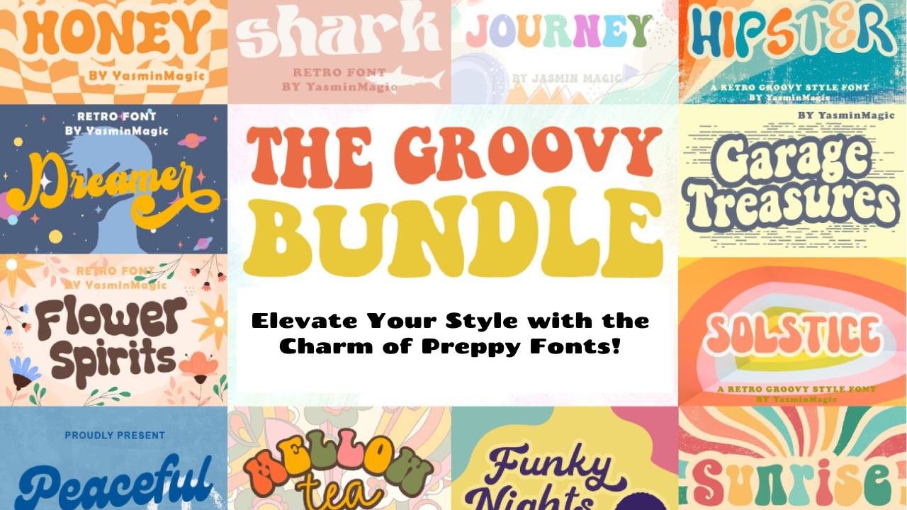
Elevate Your Style with the Charm of Preppy Fonts!
Unveiling the Timeless Allure and Versatility of Preppy Fonts in Design
In the dynamic realm of design, where every pixel and curve play a pivotal role, the significance of fonts cannot be overstated. Fonts are the unsung heroes that breathe life into words, shaping the visual narrative of brands and individuals alike.
Exploring typographic elegance, we delve into the alluring world of “Preppy Fonts” – a distinctive genre that effortlessly marries sophistication with a touch of playfulness. Beyond mere letters on a screen or page, preppy fonts embody a design philosophy that transcends traditional boundaries.
The deliberate choice of a font can be a silent orchestrator, influencing style and aesthetic appeal in ways that often go unnoticed. Join us on a journey where font finesse takes center stage, as we unravel the enchantment encapsulated by “Preppy Fonts” and explore their profound impact on the visual language of design.
Unveiling Preppy Fonts
Typography, a silent yet powerful communicator in the world of design, finds its embodiment of charm and sophistication in “Preppy Fonts.” This section will unravel the distinct features and nuances that make preppy fonts a sought-after choice, examining their definition, characteristics, and unique attributes that set them apart.


Definition and Characteristics of Preppy Fonts
Preppy fonts, at their core, epitomize a fusion of timeless elegance and modern playfulness. Defined by clean lines, sharp edges, and a refined aesthetic, these fonts encapsulate the essence of a sophisticated lifestyle.
The characteristics of preppy fonts often include a sense of orderliness, a touch of formality, and a versatile adaptability to various design contexts.
Their ability to convey a classic, yet contemporary, vibe makes preppy fonts a dynamic choice for designers aiming to strike a balance between traditional and modern aesthetics.
Examples of Popular Preppy Fonts
To truly understand the breadth and versatility of preppy fonts, it’s essential to explore concrete examples. Fonts like “Garamond,” with its timeless serifs, or “Bodoni,” known for its high contrast and vertical stress, are exemplary of preppy font aesthetics. “Helvetica Neue” is another versatile preppy font, celebrated for its clean and modern appearance.
Each of these examples brings a unique flavor to the preppy font category, showcasing how this style can be adapted to various design needs while maintaining its distinctive charm.
How Do Preppy Fonts Differ from Other Typography Styles
While preppy fonts share a commitment to elegance, they distinguish themselves from other typography styles in subtle yet impactful ways. Compared to the structured uniformity of monospaced fonts, preppy fonts offer a more dynamic and expressive visual experience.
In contrast to the flowing and personalized nature of handwriting script fonts, preppy fonts maintain a polished and refined demeanor. This section will delve into the specific attributes that make preppy fonts stand out, highlighting their adaptability and unique design contributions in comparison to other typography styles.
The Allure of Preppy Fonts
In the realm of typography, the allure of “Preppy Fonts” extends beyond mere visual elements; it encapsulates a unique charm that resonates with a timeless appeal, cultural significance, and an influential role in brand identity.
Exploring the Timeless Appeal of Preppy Aesthetics
At the heart of preppy fonts lies a timeless allure that transcends design trends. The clean lines, balanced proportions, and meticulous details contribute to an aesthetic that remains relevant across decades.
The inherent simplicity and elegance embedded in preppy fonts make them a perpetual choice for designers seeking to infuse their creations with a touch of classic refinement. In an ever-evolving design landscape, preppy fonts stand as a steadfast symbol of enduring style.
The Cultural Associations and History of Preppy Style
To truly understand the allure of preppy fonts, one must delve into the cultural associations and rich history of the preppy style.
Originating from the elite Ivy League institutions in the early 20th century, the preppy style became synonymous with sophistication, education, and a certain understated luxury.
This cultural backdrop infuses preppy fonts with a sense of prestige and tradition, making them a choice that not only communicates aesthetics but also carries a historical narrative, linking the contemporary to the timeless.
How Preppy Fonts Can Enhance Brand Identity and Communication
In the business of branding, every detail matters, and the choice of fonts plays a pivotal role in shaping brand identity and communication. Preppy fonts, with their polished and refined demeanor, offer a versatile tool for businesses aiming to convey a sense of sophistication and reliability.
Whether in marketing materials, logos, or digital content, the use of preppy fonts can establish a visual language that communicates professionalism and attention to detail. In contrast to the stark uniformity of monospaced fonts or the personalized touch of handwriting script fonts, preppy fonts strike a balance that appeals to a broad audience while maintaining a distinctive brand character.
Incorporating Preppy Fonts in Design
The integration of “Preppy Fonts” into design requires a nuanced approach that considers not only the characteristics of the fonts but also their seamless alignment with various design elements.
This section explores effective strategies, successful examples, and essential dos and don’ts when incorporating preppy fonts into your design projects.
Tips for Pairing Preppy Fonts with Different Design Elements
Pairing preppy fonts with other design elements demands a keen eye for balance and harmony. Consider contrasting a bold preppy font with a sleek, minimalistic layout to create a striking visual impact.
Alternatively, pairing a serif preppy font with elegant illustrations can evoke a sense of classic sophistication. Strive for complementary contrasts that enhance readability and overall visual appeal.
Unlike the rigid uniformity of monospaced fonts or the flowing nature of handwriting script fonts, preppy fonts offer flexibility in pairing, making them suitable for a wide range of design applications.
Examples of Successful Design Projects Using Preppy Fonts
Examining real-world examples is crucial for understanding how preppy fonts can shine in different design contexts. Brands like J.Crew and Ralph Lauren leverage preppy fonts to convey a sense of timeless elegance, seamlessly integrating them into their logos, packaging, and marketing collateral.
In web design, platforms like Pinterest use preppy fonts to maintain a clean and polished aesthetic, contributing to an enhanced user experience. These examples showcase the versatility of preppy fonts across diverse industries and demonstrate their effectiveness in conveying brand identity.
Dos and Don’ts When Working with Preppy Fonts
To ensure the successful integration of preppy fonts, it’s essential to follow a set of dos and don’ts.
- Do prioritize readability by choosing preppy fonts with clear letterforms and appropriate spacing.
- Do experiment with font pairings to find combinations that resonate with your brand’s personality.
- Don’t overuse decorative elements; preppy fonts, with their inherent elegance, often shine when allowed to stand out on their own.
- Don’t neglect the importance of hierarchy and consistency; maintain a cohesive look across various design elements to enhance the overall impact.
By adhering to these dos and don’ts, designers can harness the full potential of preppy fonts, creating visually compelling and effective design projects.
Preppy Fonts in the Digital Age
As we explore the computerized scene, the job of “Preppy Text styles” develops to fulfill the needs of contemporary plans.
This segment investigates the significance of preppy text styles on the web and advanced plan, gives bits of knowledge into apparatuses and assets for finding and using these textual styles, and digs into how preppy text styles can lift the feel of virtual entertainment and sites.
The Relevance of Preppy Fonts in Online and Digital Design
In an era dominated by screens, preppy fonts maintain their relevance by offering a perfect blend of classic aesthetics and modern appeal. The clean lines and timeless elegance inherent in preppy fonts translate seamlessly into online and digital platforms, contributing to a polished and sophisticated user experience.
The adaptability of preppy fonts ensures their effectiveness in various digital applications, from website headings to social media graphics. In contrast to the utilitarian nature of monospaced fonts or the informal charm of handwriting script fonts, preppy fonts bring a sense of professionalism that resonates well in the digital realm.
Tools and Resources for Finding and Using Preppy Fonts
Discovering the right preppy font for a digital project requires access to a diverse range of typefaces. Fortunately, numerous tools and resources simplify the process. Platforms like Google Fonts and Adobe Fonts provide an extensive selection of preppy fonts that can be easily integrated into digital designs.
Designers can explore font libraries, ensuring compatibility with digital interfaces and responsive design. The versatility of preppy fonts allows for experimentation and customization, enabling designers to find the perfect match for their digital creations.
Read Also: Google Pixel Tablet: Specs, Release, and Price Info
How Preppy Fonts Can Elevate Social Media and Website Aesthetics
In the dynamic world of social media and website design, preppy fonts offer a distinctive touch that captures attention and enhances brand aesthetics.
Utilizing preppy fonts in social media graphics, banners, and website headings can elevate the overall visual appeal, creating a cohesive and memorable brand identity. The structured nature of preppy fonts contributes to readability on digital screens, ensuring a positive user experience.
Whether conveying a sense of luxury on an e-commerce website or maintaining a consistent brand voice on social media platforms, preppy fonts stand out in the digital age as versatile assets that enhance visual communication.
Tips for Choosing the Right Preppy Font
Selecting the perfect “Preppy Font” involves a thoughtful process that considers the purpose, brand personality, and the desired visual impact.
This section offers comprehensive tips on navigating the nuances of preppy font selection for different purposes, aligning fonts with brand personality, and the importance of testing and experimenting for optimal results.
Considerations When Selecting Preppy Fonts for Different Purposes
The versatility of preppy fonts allows for their application across various design purposes, from logos and headings to body text. When choosing a preppy font, consider the purpose it serves.
For headlines and logos, opt for bold and impactful preppy fonts that command attention. For body text, prioritize readability with a more restrained and legible preppy font.
Additionally, think about the target audience and the emotions the design aims to evoke. The considerations extend to the specific design context, ensuring that the chosen preppy font aligns seamlessly with the overall visual narrative.
How to Match Preppy Fonts with Brand Personality
The choice of a preppy font contributes significantly to shaping a brand’s personality. Begin by defining the brand’s characteristics – is it modern and sleek or classic and traditional?
Match these traits with corresponding preppy fonts; for a modern brand, opt for clean and sans-serif preppy fonts, while a classic brand may benefit from the elegance of serif preppy fonts.
Consider the industry and the emotions associated with it; a finance brand may lean towards more formal preppy fonts, while a lifestyle brand might embrace a more playful approach.
The key is to create a harmonious connection between the preppy font and the essence of the brand, ensuring a consistent and memorable brand identity.
Testing and Experimenting with Preppy Fonts for Optimal Results
Before finalizing a preppy font for a design project, it’s essential to test and experiment with different options. Create mock-ups and prototypes to see how the chosen preppy font interacts with other design elements. Test the font across various devices and screen sizes to ensure optimal readability and visual appeal.
Experiment with font pairings, combining preppy fonts with complementary typefaces to create a well-balanced and visually appealing composition. Testing allows for refinement and fine-tuning, ensuring that the selected preppy font not only meets the design objectives but also resonates effectively with the intended audience.
This iterative process of testing and experimenting is essential to achieve optimal results and harness the full potential of preppy fonts in design.
Future Trends in Preppy Fonts
As design landscapes continue to evolve, so do the trends within the realm of “Preppy Fonts.” This section anticipates the future of preppy fonts, exploring emerging styles, predicting their evolution, and offering insights on staying ahead of the curve with preppy typography.
Emerging Styles and Variations within the Preppy Font Category
The world of preppy fonts is not static; it continually evolves to reflect contemporary aesthetics. Emerging styles within the preppy font category might include innovative variations in letterforms, experimenting with proportions, and incorporating unique graphic elements.
Designers are likely to explore new ways of infusing preppy fonts with modern sensibilities while preserving their timeless charm. Whether it’s introducing more geometric shapes or exploring unconventional serifs, the future holds a diverse range of possibilities within the preppy font spectrum.
Predictions for the Evolution of Preppy Fonts in Design
Predicting the evolution of preppy fonts involves anticipating how they will adapt to the changing design landscape. With advancements in technology and an increasing emphasis on digital experiences, preppy fonts may undergo transformations to ensure optimal readability on various screen sizes.
Additionally, there might be a fusion of preppy aesthetics with other design trends, creating hybrid styles that push the boundaries of traditional preppy fonts. As design continues to be influenced by cultural shifts, the evolution of preppy fonts is likely to reflect the values and aesthetics of the times.
Staying Ahead of the Curve with Preppy Typography
For designers and brands aiming to stay ahead of the curve, proactive engagement with emerging trends in preppy typography is essential. This involves keeping a keen eye on design publications, attending industry events, and actively participating in design communities.
Regularly exploring new preppy fonts, experimenting with their application, and staying attuned to the preferences of the target audience contribute to staying ahead in the dynamic world of design.
Additionally, understanding the synergy between preppy fonts and other design elements, such as color palettes and imagery, ensures a holistic and forward-thinking approach.
By embracing a mindset of continual learning and adaptation, designers can position themselves at the forefront of preppy typography trends, creating designs that are not only current but also visionary.
As we venture into the future, the trajectory of preppy fonts holds exciting possibilities, inviting designers to explore uncharted territories and redefine the visual language of sophistication and charm.
Conclusion
In the symphony of design, we’ve journeyed through the nuances of “Font Finesse: Elevate Your Style with the Charm of Preppy Fonts.” From uncovering the definition and characteristics of preppy fonts to exploring their relevance in the digital age, we’ve witnessed the unique blend of sophistication and modern appeal that sets them apart from monospaced fonts or handwriting script fonts.
As we conclude this exploration, we invite you, the designers and creators, to embrace the allure of preppy fonts in your projects. Experiment with their clean lines and timeless elegance, and let them become the voice of your brand or the visual melody in your digital endeavors.
The getting-through appeal of preppy textual styles lies in their complex ability as well as in their capacity to recount stories that reverberate across time. Share your considerations, trials, and encounters in the remarks below.
Let’s build a community where the charm of preppy fonts continues to inspire and elevate design endeavors. Don’t forget to share this font finesse journey with your friends—let the beauty of preppy fonts ripple through the creative landscapes of many!